#I just got a new tablet and I’m still sorta getting used to clip studio
Explore tagged Tumblr posts
Text
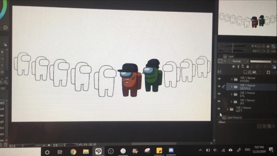
Hehe...
Hollywood Undead and friends as Among Us beans? Yes
#akb#hollywood undead#WIP#I just got a new tablet and I’m still sorta getting used to clip studio#I actually did line art for this!!! I never trace my shit#ok the was a lie I only did line art for the beans themselves#everything else was just done
25 notes
·
View notes
Photo
Have you ever been curious what font I use in my Abby and Norma comic?
Well, in the older strips, I used Apple LiGothic. Yeah, it looked nothing like how a comic strip font is supposed to look. But my fans all said that it fit the style of my comic very well, so I kept it for a long time.
And then, when I switched from Gimp to Clip Studio, I found that the Apple LiGothic font somehow looked totally different in that program. And the closest I could get to the way it USED to look was Futura. So I used that for a while.
And then I had my hiatus, and Abby and Norma was reborn from the ashes, and I started redrawing old strips, still mostly copy-pasted, but in a new style that actually looked kinda-sorta like real drawing. And with this new style, I got a strong feeling that I needed a new font.
Something that, like the new comic, looked more hand-drawn, and yet preserved a bit of what the font used to look like.
My ideal fantasy of how it should look? It was basically that I would hand-letter the comic while trying to make it look like LiGothic.
But of course I don't have the time or energy to hand-letter. So...
I went to Fontstruct.
(It was way easier than I expected. I invented "AbbyNorma Regular" in one morning, while lying in bed before work (it was an early shift, too). Took me hardly any time. I did it with my laptop trackpad; didn't even need to use my drawing tablet.
And it's far from perfect, but I'm way happier with it than I expected to be.
I'm not quite as satisfied with "AbbyNorma Handwriting," which I made for the times when Abby writes a school assignment or draws a comic of her own. (I used to fluctuate between various handwriting-esque fonts for this, so it's not like Abby ever had good, consistent handwriting anyway.)
And "Abby Computer" is just plain silly! But I made that for the rare moments in the strip when I show characters communicating digitally (like texts or emails). I don't expect it to show up very often. Making it was more just for fun than anything else.)
So, if for some weird, ridiculous reason, you like these fonts enough to use them in your own stuff, go ahead! Download links are here, under a Creative Commons Attribution license.
https://fontstruct.com/fontstructions/show/1498757/abbynorma
https://fontstruct.com/fontstructions/show/1517808/abbycomputer
https://fontstruct.com/fontstructions/show/1505766/abby-handwriting
See this post at https://www.erikahammerschmidt.com/2018/10/09/font-abby-norma-comic/
---------------
Follow for more alien/avian/autistic slices of life. I make crafts, write books, keep pets, grow plants, and have insights. https://www.erikahammerschmidt.com
---------------
1 note
·
View note
Text
Creating Saturn
A bit of my process again, and some insights on why things are the way they are in it.
So this art project was mostly based on my wanting to revisit my takes of the incarna from late 2013 to 2014 and do them in color. While I liked the colored results of Luna and the Unconquered Sun, they were still pretty primitive compared to the art i was following on DA and also even what I felt I could do as I was working on my character portraits for my own Exalted games and as I got back into drawing more and more again. I felt this standing out quite a bit when I finished my retakes of my older characters the Lead Knight and Unhesitatingly Loyal Weapon, plus the art I did for some PCs in my group and Anime Banzai. So I got a desire to revisit them, this time though going a tad backwards and starting with Saturn instead of saving her kinda-for-last.
For reference, this is the original drawing that I uploaded back in early 2014.
This one was pretty fun for how dynamic it was and I feel the fun of also having her outfit base don Buddhist robes and generally working out. For this picture I wanted to not do a full body shot, because I wanted to have a background and also wanted to avoid some proportion issues that sometimes slow down these pictures if I try to do seven characters in the same area. That said, I liked this almost martial arts pose she was in, and wanted to evoke that in her new picture. So I went and busted out the pen on paper and sketched a layout as I am want to do.
This is chaotic but how I often will lay stuff out. I wanted to do the hand out, and sword behind her and looking at the viewer. I also wanted her to have this almost authority to her, looking down at a viewer. Her pose and outfit shifted quite a bit as it got to sketching but whatever.
The next step was to bust out the tablet and get to work. I decided to experiment with art programs and did the initial sketch in Sketchable, which is a really neat Windows 10 app for well...sketching. It’s pretty fast and lightweight and so I thought it would be good for starting pictures. And to be honest, it did. Takes a bit of learning though, but it has good pencil tools and is good for getting the picture started, though I don’t think I’d finish thing sin it.
With that in mind, I sketched based on the original pose idea, plus how things shifted along the way. I kind of wanted to do this kind of sexy “left had forward, right leg forward” thing where it looks like she’s walking towards the viewer, as well as having her have a fairly calm-but-cute face. Also ahoge, since original image had one.
With her laid-out in digital pencil, I exported her to PSD and into Clip Studio Paint. Here I did standard inking, using Masks in her sword’s design to help make sure it was preserved in all stages of the drawing. Some things one might notice is her sword is closer, her head got a tad straighter, her boobs became more proportional and her left had got a bit of a tilt to be clearer. Lots of things happen like that in clean-up, so not too unusual to be honest.
Wanting to do flats next, I proceed to take a step back from her and do the background. There are two big elements here to be added: The actual starry sky behind her and the omega that I am using. I start with the stars, which I built out of a combination of Photoshop Filter effects, plus some things in Clip Studio with gradients and better transparency controls. I added the five constellations associated with Saturn by hand and rearrange them throughout the drawing’s process to get them in better places.
I built the omega out of various form tools. And then I finally did its glow using some effects I learned years ago with layer blending, overlays and masks. I don’t have a flat version of it here, but you can see its version used in the final image here:
Now that that’s done with I can move to coloring our Maiden of Endings.I introduce her flat colors, with further tweaks to things like her hair (head was too big to me, bangs needed a trim) and the sword (straighter). I also add the Old Realm characters and gems to her sword.
I want her sword to have this nice iron or lead look to it, so hence the dull dark color. ANd there’s also a want to have her legs flow, but this is where I start hitting some problems. Mainly I don’t think her leg/thigh looks proportional with her arms. She seems pretty skinny (if top-heavy) in the upper part, but not as much in the lower. I try to fix this by obscuring the length of her leg and trim the left sid of her skirt, but this creates image balance issues.
I then try this in the shading, which sorta works, but sorta doesn’t.
I try a lot of things but in the end the shading on her left side isn’t working for me. So I take a break, shade her sword, her brazier, add smoke all that. The solution I find is to just expand her waistband thing. I go back to the Buddhist monk robe design I mentioned earlier and from there, shading progresses withotu much a hitch. As a factoid, not shown here I have about six versions of how I shaded her left skirt part. This was the largest delay in the picture I think.
This step is pretty easy to see where things go from here. The kind of wrap thingy I like since it does make her outfit look more Buddhist and it also helps hide the width of her waist, which I feel makes her figure fit together better. It’s also a nice contrast on shading since it’s a lot duller and less reflective than her silky purple and her leggings. Leggings I did a bit of fun with. I made a layer with a pattern brush of her skin tone over the already shaded leg and used layer blending to get that nice stocking look. Quite happy with it.
Most the rest is finishing touches. I add the glow effects for her talismans, the sword, and the brazier. I also take a moment to add some level adjustments. I think the original is a bit washed-out looking and so I increase contrast and adjust levels to make things pop more.
This was a pretty enjoyable art project I find. I like how the character came out and I like what I learned in and program use as I did it. I think if I were to say personal issues, it’s I wish it was still a bit cleaner line-wise. And I do wish I could have gotten all five talisman things in here like i did with the orignal pencil drawing, but to be fair, that’d of made the composition of this thing a mess, so probably for the best.
As a bonus, here’s the sword and the brazier, actually. Since I’m sure some folks would not mind seeing them all on their own.
And until next time, peace out. Currently working on Venus. That’ll be fun to say the least.
And stuff.
4 notes
·
View notes